By Dyfed “Fred” Richards, Kaleidoscope
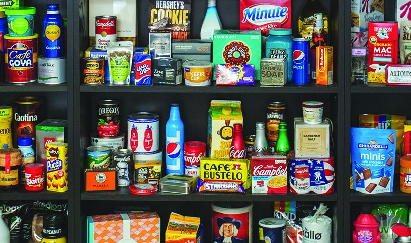
Packaging, sadly, is one of the last things considered when it comes to the marketing mix. Advertising, PR events, stunts, social media and other “glamorous” initiatives seem to get preferential attention over the primary delivery of many brands – the package.
So when do you really know it’s time to reevaluate and update packaging graphics? What are the rules? We get a lot of questions regarding when and how to tackle packaging updates. Here are the top six signs it’s time to update (and pitfalls to avoid) based on 25+ years of experience.
1. IT’S BEEN SIX YEARS SINCE THE LAST UPDATE
Six years is adequate time for any package design to be considered for an update. Within that time, the category itself and the internal team responsible for the brand have evolved. This is a critical distinction from the outdated and overused terminology of “evolution” or “revolution” of the brand’s articulation at shelf. An update should not be made for the sake of change or a fleeting trend. Marketers and designers should collaborate to craft the package design with the aim of tying it closely to a strategic positioning that is relevant to the consumer.
2. YOUR COMPETITORS HAVE CHANGED
As mentioned, six years in a fast-moving, consumer goods category is a long time for some brands to stand still, especially if you want your brand to be positioned as a category leader. At the beginning of any design initiative, it is important to evaluate what has changed and who has changed. Tracking is critical to understanding the trends and agility of any competitor. That is not to say that we are proponents of benchmarking versus the competition, but it’s important to understand the strengths and weaknesses of your competition to know when best to strike.
3. YOU’VE DISCOVERED WHAT CONSUMERS AREN’T TELLING YOU
The obsession with consumer research sometimes adds to the fog of war of when to change and why. Consumers are getting smarter, but as much as they want better products and brands that cut through the bull, they’re not very good at articulating what is in their heads. However, consumers leave crumbs of evidence if you know where and how to look. Get out of the research labs and away from the late night takeout. Go to their homes, have a conversation, use the brand with them, and go shopping. Open up, be honest and enjoy the journey with the consumer. If they feel respected and knowledgeable, they will tell you everything, including the truth!
4. THE TIMES ARE CHANGING
There is a difference between an “aesthetic trend” and real category movement. Many agencies miss the difference and are quick to pour scorn on a new design look and feel, especially if it comes from a competing agency. First, identify the category design language – every category has one. Understanding the brand’s assets within this context is critical before you embark on any design exercise. Then look to the styles, languages, shapes, and effects that can be applied to amplify the brand’s message. Don’t trend for trend’s sake, but ensure the brand remains relevant.
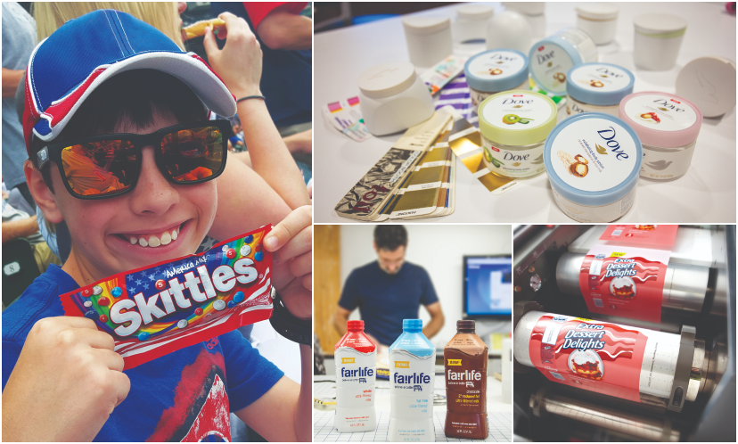
Courtesy of Kaleidoscope
5. YOU CAN CLEARLY SEE ISSUES FROM THE RETAILERS’ POINT OF VIEW
Now more than ever, we hear that retailers are under increasing pressure to delight consumers within aisles, especially in the center of the store. With increasing category growth and brands competing for the same retail space, categories and entire aisles have become fragmented. The change, if addressed correctly, could be as simple as basic design housekeeping, not a drastic overhaul. Try to understand what the retailer is seeing that the design brief is not addressing.
6. YOUR BRAND MESSAGE HAS GOTTEN LOST
Every brand should continually look in the mirror and question why certain assets or packaging details exist. Understand the stories behind the elements. The brand message on a package is often diluted little by little with small changes over time, but it’s hard to see without taking a step back. True brand consultancies will find creative ways forward that are based on brand fundamentals and consider the underlying strategy.
YOU HAVE A VISION. WE CAN GET YOU THERE.
Kaleidoscope is an independent brand consultancy with a global reach. Our teams connect insights with strategy, design and prototyping to deliver integrated solutions with speed and agility. But it’s not just about how we integrate, it’s why. Regardless of the product or service, your brand’s potential for sustainable growth is in the hands of consumers. Our approach to developing your brand’s strategy is not just about big ideas; it’s about delivering tangible business results across multiple touch points. Integrating strategy, design and prototyping ensures your brand assets are firing on all cylinders and delivering a return on your investment.
ABOUT THE AUTHOR
As CCO, Dyfed “Fred” Richards ensures that Kaleidoscope leverages its diverse creative talent from all offices across the globe to generate fresh, strategic packaging design solutions for clients. Fred has worked in the international design industry for more than 25 years, specifically in the “Fast Moving Consumer Goods” category. Having worked for some of the world’s leading branding and design companies in Britain, USA, Switzerland, Fred brings a multifaceted perspective and rich design philosophy to Kaleidoscope’s design.
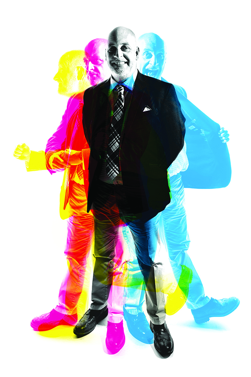
Dyfed “Fred” Richards. Courtesy of Kaleidoscope
LET’S START A CONVERSATION.
Contact Elisabeth Emory, Regional Account Director, Middle East at Kaleidoscope for more information. eemory@thinkkaleidoscope.com.

