When half of your higher education is dedicated to Typography courses, you tend to hold fonts in higher regard than a normal person. Most people don’t look at a storefront and groan, “Ugh – Papyrus,” but even though not everyone is a designer, almost everyone uses fonts. So, what does your choice say? Here is a rundown of some commonly used (or misused) fonts and what they convey.
Comic Sans
“I don’t take myself seriously (in a bad way)”
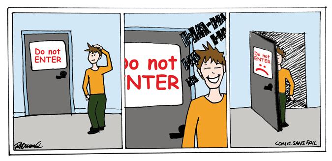
When we were thirteen and using MSN Messenger, it was cool to use Comic Sans to send messages. It is not cool now. Actually, it was never cool; we were sadly too naive to see it. Comic Sans was a font created specifically for use in children’s books and comic books. It’s become so widely used that it crops up in all sorts of inappropriate circumstances. For example, if you set a “DO NOT ENTER” sign in Comic Sans, I can guarantee that there is no way anyone is taking that message seriously – you might as well add a smiley face after it and invite people in for coffee. Thankfully many designers make it their mission to educate people on the horrors of using this ugly font, with amusing websites like comicsanscriminal.com. I’m aware that it’s now trendy to hate on Comic Sans – but I truly do hate it – it was actually painful for me to include it in this layout.
Other similar offenders:
Chalkboard: Seriously, writing on a blackboard does not look like this.
Papyrus: The Ancient Egyptians wouldn’t even appreciate this obscenity.
Times New Roman
“I take myself too seriously (and I’m boring)”
Look, Times New Roman isn’t quite on the “please never ever use this” level that Comic Sans is on, but if you’re not writing an academic paper, a corporate letter or some quick notes that are not being presented for viewing, then I promise you, there are more interesting typefaces out there. Absolutely, submit your essays in Times New Roman – it is a legible, unobtrusive font that is meant for reading, but please don’t set your magazine articles, advertisement headlines and personalized notes to friends in this sad, bland lettering.
Serif fonts that do the same thing in a more stylish way:
Adobe Garamond, Bodoni, Caslon, Perpetua.
The sans-serif equivalent of Times New Roman is Arial – default, no personality but standard. It was also Windows’ answer to Helvetica, which is code for ‘cheaper imitation’. Arial should be used on webpages and hardly anywhere else.
Helvetica
“I’ve watched the documentary.”
Helvetica is a great font. They made a documentary about it and it was highly acclaimed. Yes, a documentary about a typeface was well reviewed! As the biggest typography nerd I know, I find Helvetica a little vanilla. Vanilla is safe and guaranteed to taste good. Helvetica should be where you start from – a nice fall-back option, especially for minimalist layouts – it jumps off the page in a simple, clear way. You can’t go wrong with Helvetica, but if you are open to it – I’ve got some cool options to trade in when you’re looking for some adventure.
Non-Vanilla Sans Serif fonts:
Gotham: this is the typeface that the Obama campaign uses for his logo – regardless of your feelings about the administration, you can’t deny that their branding has style. Pair Gotham with the serif face
Impact
“I’m trying (but trying too hard)”
If I see a poster that uses Impact, I smile a little. A non-designer is obviously attempting to make an impression – an impact, if you will – but doesn’t it hurt your eyes? It looks like it’s shouting at me and it’s not saying “Hey! Come look, this is awesome,” it’s saying: “YO! YOU. I WANT TO TELL YOU SOMETHING THAT YOU DON’T REALLY WANT TO HEAR.” If you need more dissuading – Impact is the font people use for internet memes – ick. So take it easy on the Impact – make a more lasting impression with condensed fonts like: Trade Gothic Condensed (bazaar headlines,) Univers and Futura.
Some other nice headline options are:
Gotham (again), ITC Avante Garde and Century Gothic.
So, what have we learned (other than I am a judgmental type-ist)? Simple is better than crazy. Interesting is better than Default. And when in doubt, consult a graphic designer – there is a reason entire universities are dedicated to teaching design, we know what we’re doing. If you don’t have a designer on speed dial, google “fonts you should never use” there are several other judgmental type nerds out there who’ve written tons of handy dandy lists of advice.


